Colors have a unique way of shaping our emotions and reflecting the ever-changing world around us. Every year, the Pantone Institute chooses a Color of the Year that captures the mood, aspirations, and cultural trends of the moment. This decision has a huge influence on industries like fashion, beauty, and interior design. For 2024, Pantone has crowned Apricot Crush as its Color of the Year—a vibrant, uplifting shade that promises to set the tone for the year ahead.
Looking back to last year, Pantone chose “Viva Magenta,” a bold purplish-red that they described as “unconventional” and perfectly suited to its time. This striking hue reminded us of color’s ability to not only reflect the current moment but also stir powerful emotions.
In this article, we’ll dive into how you can incorporate Apricot Crush into your wardrobe, beauty routine, and home décor, along with ideas for pairing it with other colors to create stunning combinations.
Table of contents
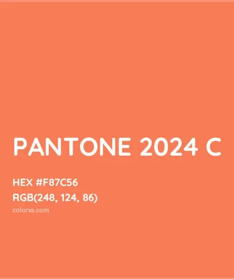
Apricot Crush – Pantone Color of the Year 2024
Apricot Crush is more than a visual aesthetic. This soft orange shade evokes healing, energy, and revival. It has been named the Color of the Year 2024 due to its relevance in times of emotional complexity and uncertainty. Symbolizing care, connection, and community, it is perfect for designs, fashion, and spaces that inspire comfort. Beyond its visual appeal, Apricot Crush reflects the nourishing qualities of vitamin-rich oranges and apricots. Its selection highlights our shared desire for tranquility and positivity.
Visual Representation of Apricot Crush
Apricot Crush adds elegance and vitality to various applications. It brings a fresh, invigorating look to fashion, interiors, and product design, creating a warm, welcoming ambiance.
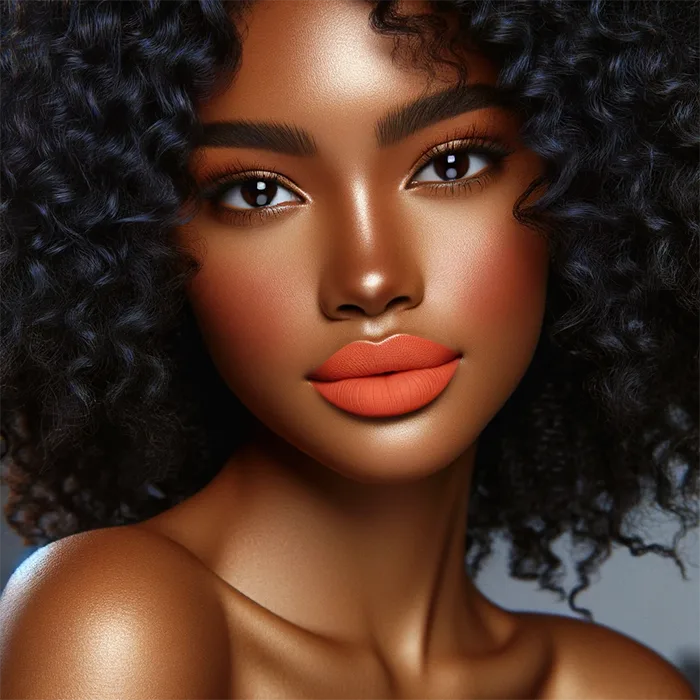
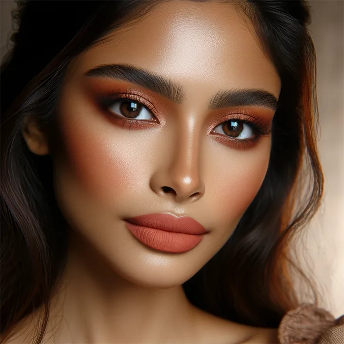
in the World of Cosmetics: Apricot Crush offers exciting possibilities for incorporating its captivating chromatic expressions into beauty and cosmetics.
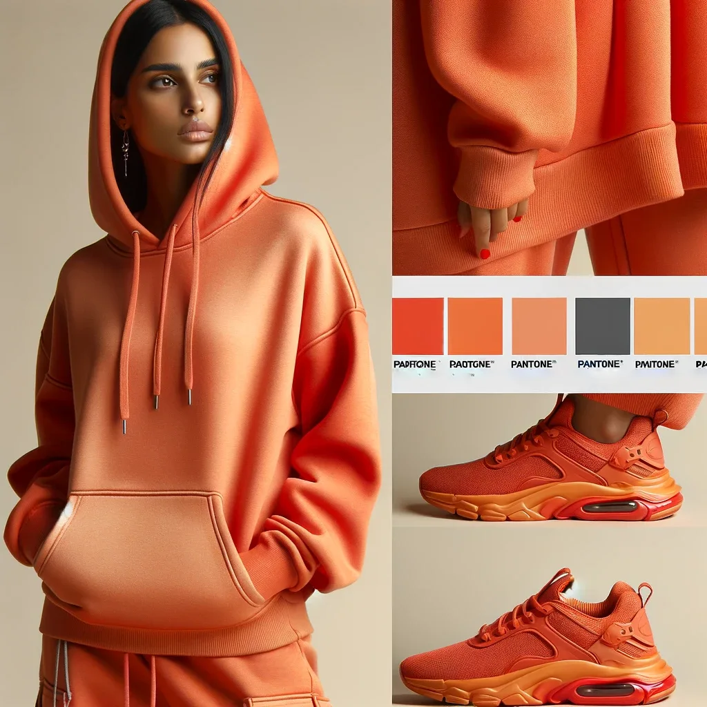
Fashion and Apparel: Apricot Crush can create stunning fashion and apparel lines.
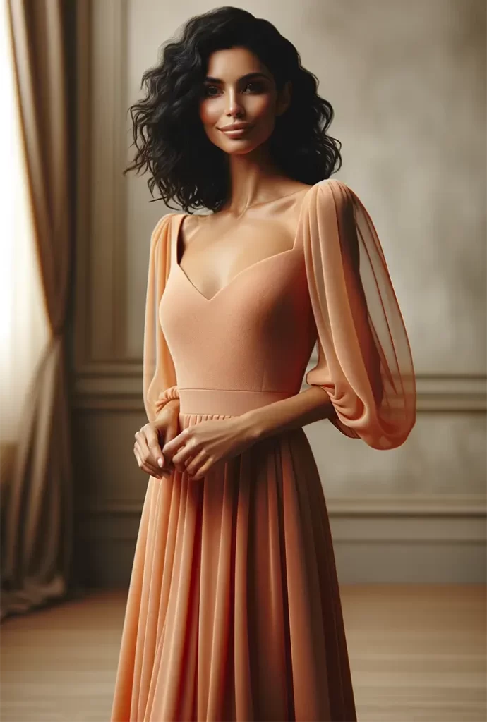
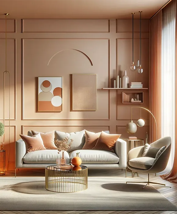
Interior Design: In interior design, it can be used to add accents that make a living space more inviting.
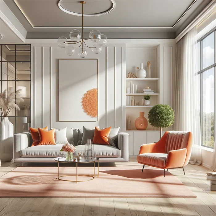
Product Design: gadgets and accessories featuring Apricot Crush can add a trendy and vibrant touch that appeals to consumers.

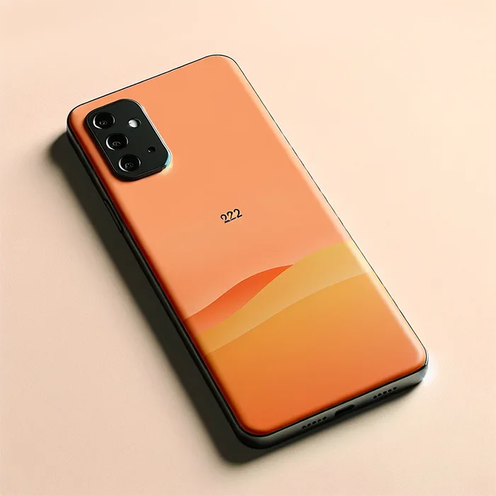
Overall, the beauty and impact of Apricot Crush make it a color worth considering for various design applications.
what colors go well with Apricot Crush?
Apricot Crush is a versatile color with a warm, peachy-orange hue, making it a great addition to various color palettes. To enhance the color’s vibrancy, here are some color combinations that complement Apricot Crush beautifully:
- Cream and White: These neutral shades can soften the brightness of Apricot Crush, creating a gentle, inviting palette.
- Soft Greens: Sage green or mint green can complement the warmth of Apricot Crush with a touch of coolness, bringing balance to the color scheme.
- Teal or Turquoise: These blue-green shades create a vibrant and lively contrast with Apricot Crush, perfect for a more energetic look.
- Deep Blues: Navy or royal blue can provide a striking contrast to Apricot Crush, making for a bold and sophisticated palette.
- Earthy Tones: Colors like taupe, beige, or terracotta can pair well with Apricot Crush, giving a natural, grounded feel to the color scheme.
- Metallic Accents: Gold or copper accents can enhance the warmth of Apricot Crush, adding a touch of luxury and elegance.
- Dusty Pinks: Soft, muted pinks can harmonize beautifully with Apricot Crush, creating a delicate, romantic look.
- Rich Reds: A deep red or burgundy can pair dramatically with Apricot Crush, ideal for a bold and passionate color scheme.
Conclusion
The Pantone Color of the Year 2024 is Apricot Crush. This color trend goes beyond just being a popular choice for designers. It represents a worldwide demand for colors that evoke comfort and positivity. Apricot Crush is a shade that speaks to the collective need for tranquility and well-being. It is more than just a color choice but a hue that resonates with everyone’s desire for a brighter and more optimistic future.
Related:


